
Choosing Paint Colors for Older Homes
/A fresh coat of paint will protect your home from the elements and make it look its best. Then, there is the question of what color to choose. Beyond just finding colors that appeal to you, if you have an older home, choosing a color palette that’s in line with its architectural style will make the house reflect the character in which it was designed.
Three distinct sections of the house exterior can be painted: the body (clapboards, shingles, or exterior siding), the trim (decorative wood surrounding the edges of the windows, doors, and other features), and the window sash and door (the moving parts).
The Cambridge Historical Commission has published a guidebook on color choices that reflect the originally designed architectural styles of local houses: Painting Historic Exteriors: Colors, Application, and Regulation. Here are some of their recommendations:
First Period (1625–1725) homes were not painted on the exterior. Color was used only to highlight interior features, but no color was used on the exteriors except for some trim elements, which could be painted a dark red ocher. However, most of these very old homes were renovated and repainted later in the eighteenth century. Those that have preserved their original appearance are mostly owned by museums.
In Georgian architecture (1725–1780), larger buildings—particularly public buildings or the homes of well-off urban people—would be painted, but often rural homes would not. Exterior paint choices during the eighteenth century had contrasting schemes and light or white trim. The body colors of dark stone, chocolate, ochers, grays, and reds would be complemented by dark chocolate, red, green, or blue doors. Trim detailing was often painted a stony color and could even be dusted with sand as paint dried to appear as stone.
Federal architecture (1780–1820) home exterior colors were much lighter than in the Georgian style and included white, cream, straw, and ocher. Shutters first started to be used during this period, and they, along with windows and doors, should generally be painted green or black.
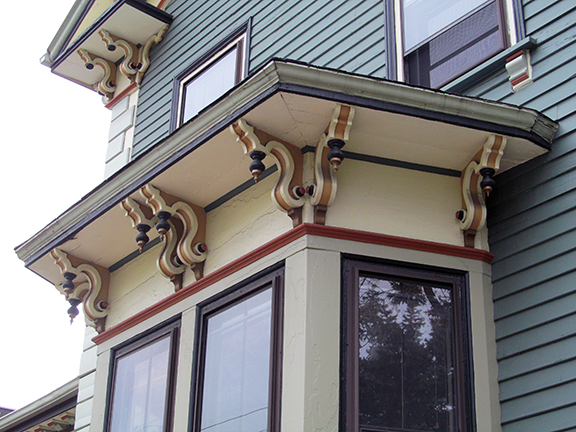
Colors characteristic of the Greek Revival (1825–1860) style are similar, and include stone grey, straw, cream, and off-white. One of the most typical paint schemes was off-white with green doors and shutters and black sash.
Italianate and Gothic Revival architecture (1840–1880) often used two closely-related colors, with a trim color only slightly different from the clapboards. Generally, homes of this era featured colors that blended into natural settings around the houses. Soft, neutral grays and some ochers were used; white, yellow, red, blue, and black were avoided. The trim was often a darker shade of the color used on the body of the house.
Suggested colors for Second Empire (Mansard) Architecture (1855–1885) include grey, tan, ocher, warm beige, russet, olive, gray-green, and brown. Use two shades of the same color, one for house and one for trim. The sash and shutters should be black or dark green.
For Stick style (1860–1890) buildings, trim and clapboards should be contrasting colors or colors that stand out to bring out the building’s geometric elements. Examples include yellow with dark green, dark red with olive green, or light and dark gray-green. The sash and doors should be dark.
Queen Anne style (1880–1915) looks best with rich, dark colors. Olive green, maroon, and other dark shades are popular, with an even darker sash to create the appearance of recessed shadows.
Shingle style (1880–1900) is characterized by colors reminiscent of wood: shades of dark brown stain work best. Darker greens, grays, and browns can be used, but should be darker, deeper shades. Trim should either be a contrasting dark color or a matching lighter color to the body of the house.
Colonial Revival (1885–1915) homes are marked by lighter colors, so the use of ocher, yellow, tan, gray, blue, and green with an off-white trim is ideal. The sash should be the same color as the trim.
Georgian Revival (1900–1930) style also uses the lighter colors of yellow, tan, gray, blue, or green with white trim. Doors and shutters can sometimes be painted a brighter color, but the sash should still match the trim. Garages should match the house exactly. If the house is made of brick (as a few are), do not paint the brick, but paint the trim as described above.
For Craftsman/Medieval Revival (1900–1930) homes, stick to rustic earth tones. Brown, russet, and dark beige with darker green, brown, red, or olive trim works best. If bricks are used, try to find a trim color that matches the tones in the bricks.
Thanks to Sally Zimmerman of Historic New England for her help preparing this article.
—Sean Yarolin